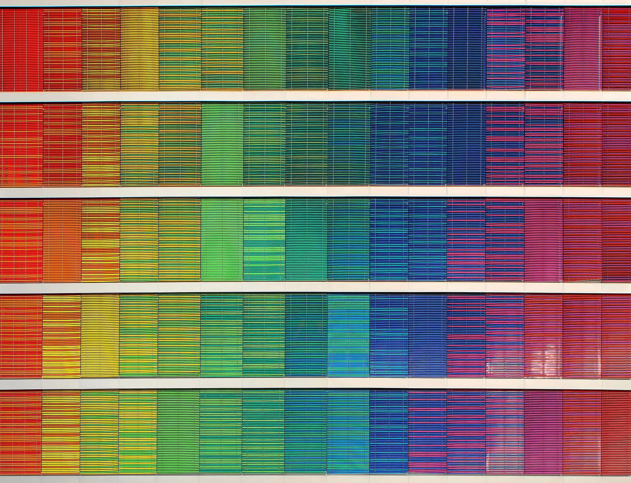
Color persuasion involves the philosophy behind colors and how consumers (knowingly or not) interact with those colors. Certain colors, for example, may subconsciously make a person feel safe. If your website influences the users with color, you may be able to set a tone or mood that is necessary to make your ecommerce business successful.
Color is not an exact science. Different cultures focus on the same color in different ways. For example, yellow can represent courage in Japan, while yellow in the Western culture can be referring to cowardice. Because colors have different meanings for different people, it is important to relate your website with the colors suitable for the target audience.
For the Western civilization, colors represent a variety of moods and feelings when they’re viewed:\
-
The color red is often associated with things like Valentine’s Day or Christmas. The context of the color is important. For Valentine’s Day, you’d likely see red paired with white and pink, while a Christmas red is generally paired with green, silver, and gold. However, without context, red also has other connotations. It can be used to represent anger, danger, or anxiety. Red is used for stop signs and stop lights, which also refers to danger. Red also can physically cause the heart rate to increase, as well as the metabolism and respiration.
-
Orange can be used to represent a call to action, changes, joy, or aggression. It is between a red and yellow, so it does share some aspects of both colors. Orange is generally associated with autumn.
-
Yellow, on the other hand, is a positive color. It represents optimism, sunshine, and hope. It is a great way to add a burst of energy and cheerful color to a website. In the Western cultures, yellow might be associated with cowardice, so it should not be overused on a site.
-
If you’d like to give a trustworthy or friendly vibe off on your site, try using the color blue. Blue is often used by banks or social networking sites. However, a bank might use blue with green, the color of money, to make you feel that the money is secure in its location.
-
Green, while a symbol of wealth, can also be representative of the environment, jealousy, and envy. Green is the easiest color to look at, so the context and alternate colors used are an important factor when being used in combination.
-
Purple can be used to represent creativity or royalty, as well as wisdom. Love and romance can sometimes be represented by light shades of purple, like lavender or periwinkle. Combined with pink, which represents calm, friendship, love, and romance, purple could be used to represent a loving and romantic site.
-
White is a color most often used in combination. This color can represent emptiness when left alone, as it is a stark color. It generally is associated with positive connotations. This could be used with black, for instance, which represents power, elegance, and a feeling of classiness.
-
Gold is often used to represent wealth or prestige. This color is not usually used as the main color on a webpage, but may be used as a secondary color scheme. Gold is very similar to yellow, so if it were to be used as the main color it would take on the same meanings as yellow.
-
Silver is also used to represent prestige; however, it is colder in nature. This means it is not going to evoke as happy an emotion as gold might in the same circumstance.
The psychology of colors used on a website can help improve the visibility and memorability of a site. Logos often use a color scheme that makes them memorable. For one example, yellow and blue is used for the Build-A-Bear logo. This evokes a happy, cheerful, and friendly feeling. Other logos might use red and black to represent aggressive, but classy, activities, such as cards or gambling. The way you represent your site can be changed to influence your consumers very simply by changing the colors and theme of the page. Color has been shown to influence brand recognition by up to 85 percent.
Agressive, but classy: the colors in a card deck[/caption]
In other research about the philosophy behind color persuasion, 93 percent of respondents stated that color was important to their purchase. A total of 85 percent stated that color was the reason for a purchase. Then, 80 percent agreed that the color of a brand represents consumer quality. For an example of how these statistics can be applied, take the color red. You’d normally see this near a clearance section. This increases the heart rate of consumers, creates urgency, and gets their attention. Green may be in areas of expensive pieces. Green is used to associate the items with wealth and is used to help the consumer relax.
Keeping these color associations and the cultural deviations in mind while designing your webshop is a great way to use color persuasion in a way that benefits your business. How do you make use of the colors on your webshop? What emotions are you trying to evoke?
If you want to read more about Color Psychology, I’d highly recommend reading Color Psychology by Brian Cugelman.
